Client
Hundred
Hundred
2020
User testing
Prototyping
AB Test
Hundred is a subscription-based supplement retailer, helping users discover what vitamins they need to optimize their day-to-day performance, to relieve a chronic condition or to generally feel healthier.

As Product Designer, my work focused on uncovering user pain points within Hundred’s current flow, identifying the struggles users faced in reaching their overall health goals and testing the acquisition user flow.
100 users tested using in-person usability testing and remote recorded testing. Insights gathered in a report.
Interactive prototype handed to the dev team to review microtransactions and precise code.
Prior to launch, prototype usability tests and A/B tests were run for seven days based on current traffic.
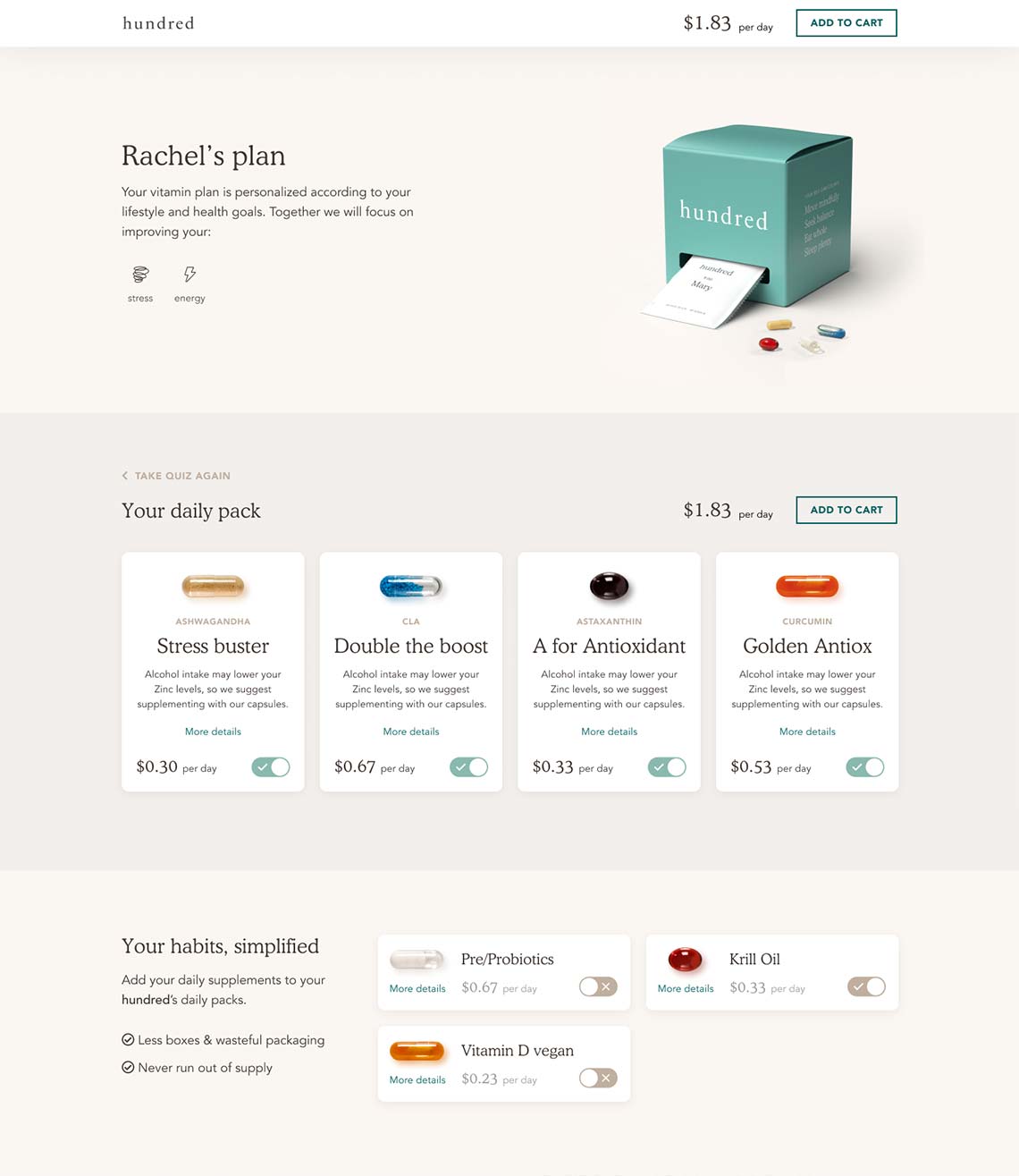
Hundred helps customers reach their health targets by recommending supplements based on their unique profile.
Although this process attracts users with an good understanding of dietary supplements, it does not appeal to beginners or experts.
Beginners don’t know where to start and want guidance
Expert users can’t see the advantage of automated advice.
The online retail market for supplements was rapidly expanding; Hundred was looking to jump into an intensely competitive space. To stand out, they needed to offer something different.
User analysis revealed that although 70% of unique visitors completed the quiz and browsed through vitamins, only 5.3% proceeded to the shopping cart.
Hundred was looking to position itself as the expert voice in health supplements. Not only can customers ‘personalize’ their vitamins, the product also offers:
The business goal was to increase the conversion rate and promote a three-month prepaid subscription to increase the average basket and reduce the CAC.
Google Analytics revealed user flow friction on the Recommendation page. Over 100 usability tests were run over a three-month period on the following flow:
The usability issues and pain points identified were clustered into four categories.
The number one reason for exiting a page was insufficient information provided on an individual supplement.
Users who wanted to consult a nutritionist or doctor before proceeding to the shopping cart.
Users who exited the site to search for company reviews and social media accounts.
Usability issues and confusion about the product.
Users who exited the site to search for company reviews and social media accounts.
Users who wanted to consult a nutritionist or doctor before proceeding to the shopping cart.
The number one reason for exiting a page was insufficient information provided on an individual supplement.
Usability issues and confusion about the product.
Based on UX principles, the above insights and brand principles, the design provides users with a more immersive experience.
Header section
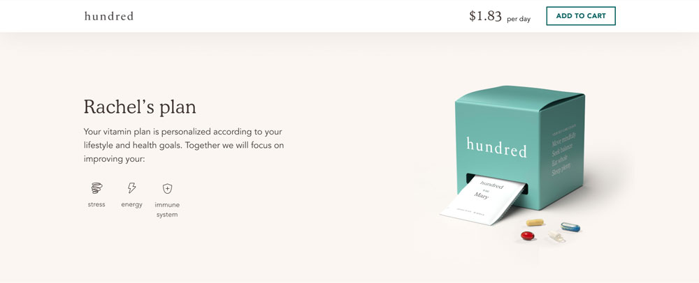
Recommended vitamins
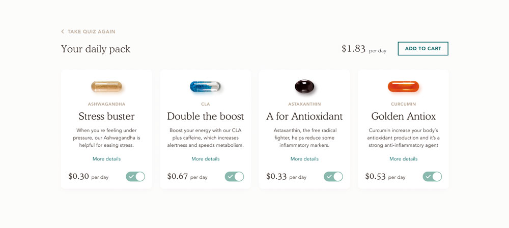
Upselling section
The deployment was iterated in a series of monitored releases, prioritized on an ROI base, and saw the light after three months of design. Few adjustments were required based on additional discoveries and requirements.
Prior to deployment, a series of progressive A/B tests were launched to monitor progress over a period of seven weeks. The metric selected was conversion rate from the Recommendation page to the cart.
The test showed a good outcome and provided additional learnings for on-the-run revisions.